Social Media Ads & CollateralGOONZQUAD
From Salvage to Custom Supercar
CHALLENGE
Goonzquad operates a high-volume "Buy-to-Win" sweepstakes model for their 2.8M subscribers. The challenge was to create marketing assets that didn't just look "premium," but actively drove sales under tight giveaway deadlines. Every ad and email had to clearly communicate the dual value: receiving a high-end "Goonzquad" product and gaining entries to win their custom-rebuilt supercars.
INSIGHT
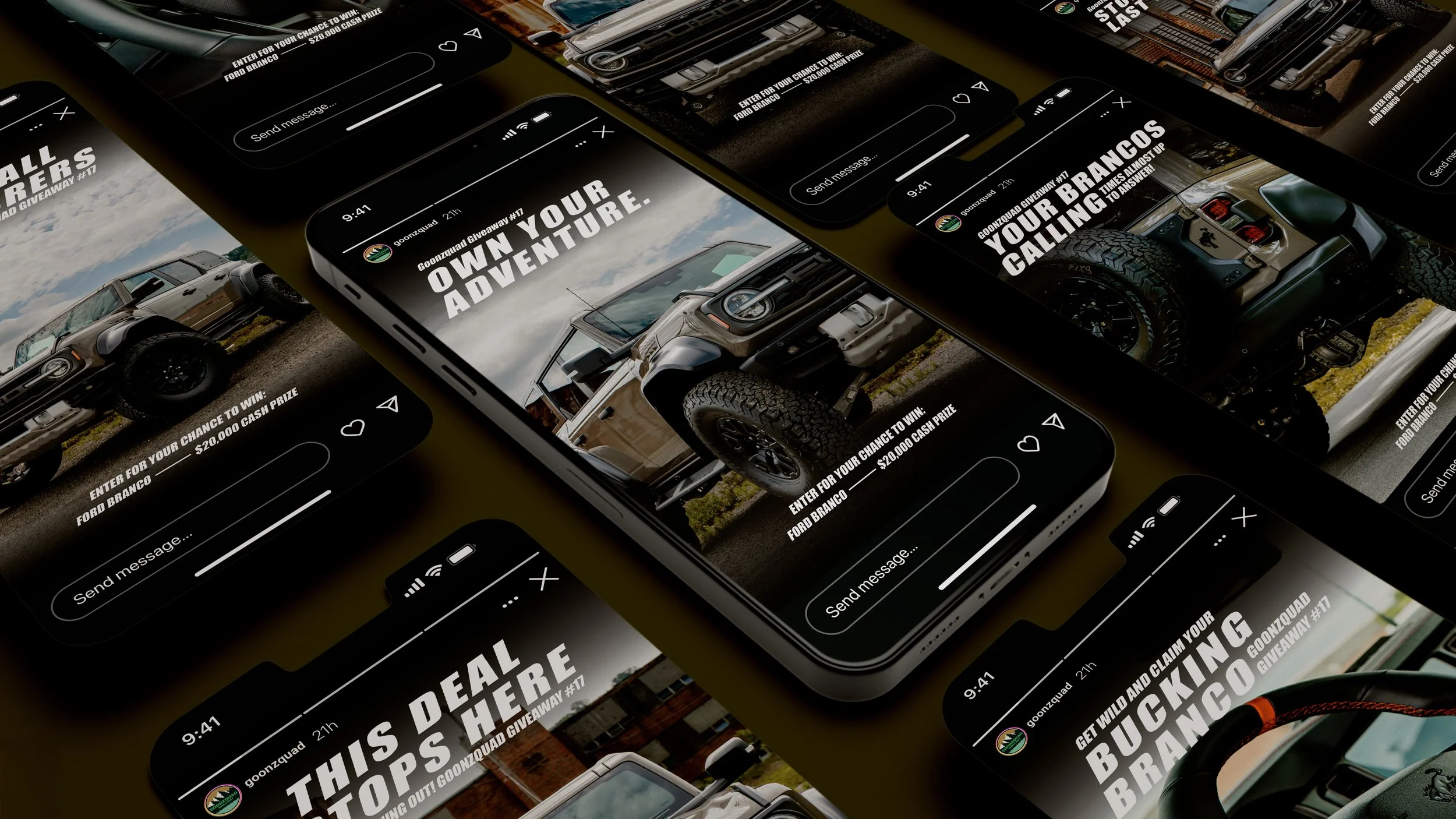
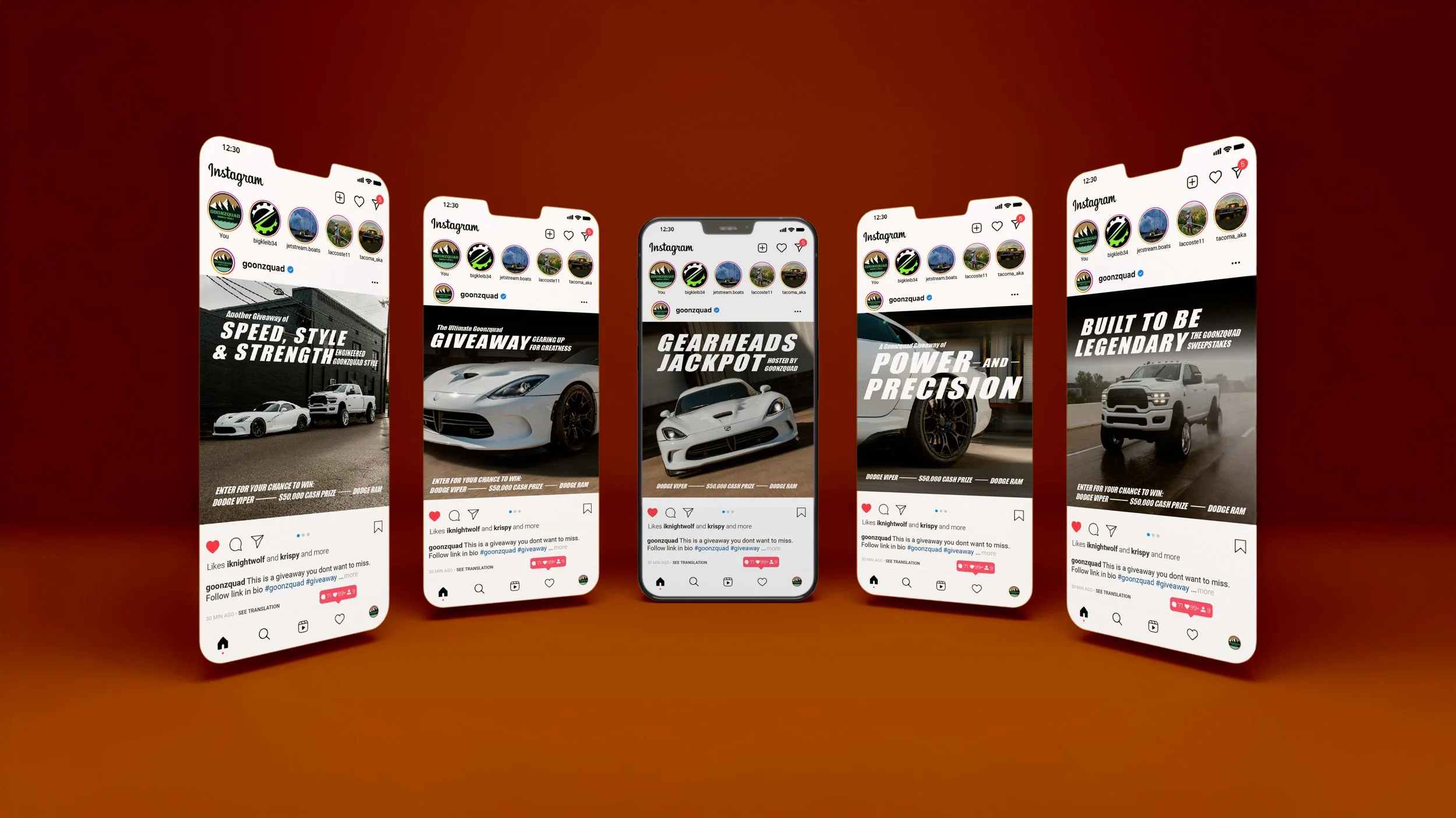
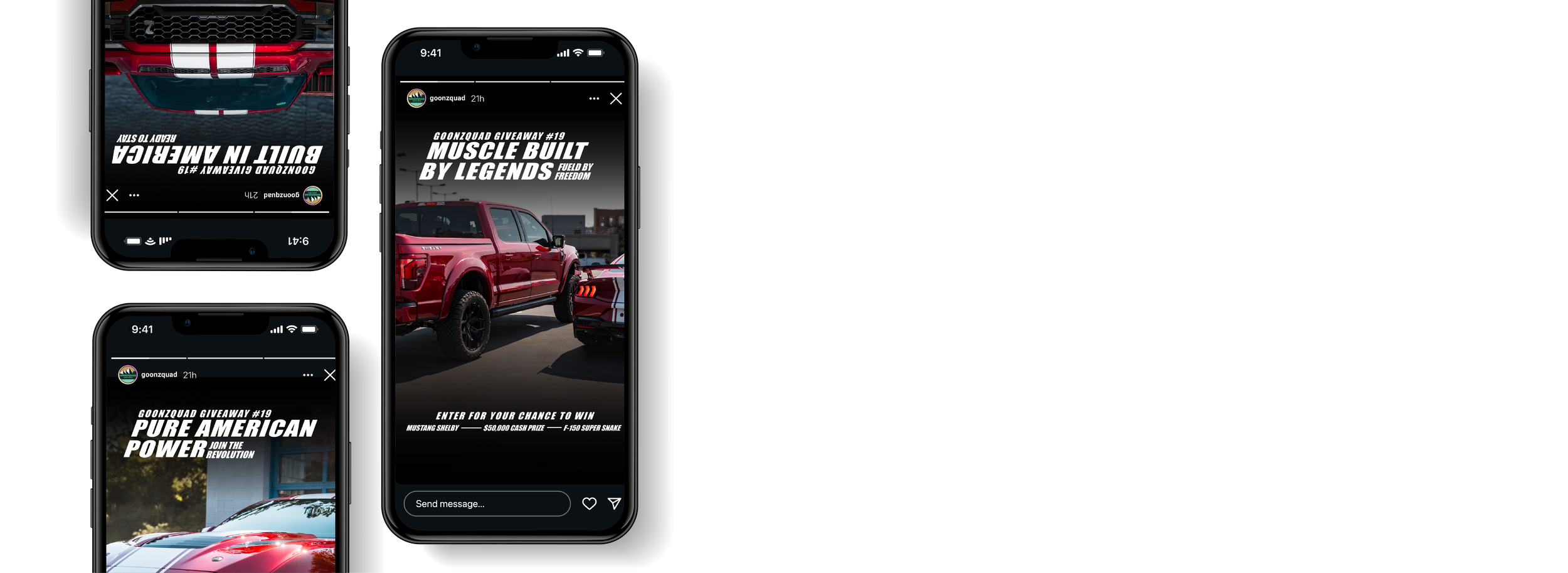
In a sweepstakes driven market, clarity equals conversions but emotion drives the click. While the industrial luxury aesthetic appeals to the male 24 to 55 demographic, the visual hierarchy must prioritize the entries.
The true psychological hook was making the consumer feel incomplete without the car. We moved past the "win a prize" mentality and spoke directly to the deep seated need for speed and status. We weren't just selling entries; we were selling the missing piece of the driver’s lifestyle.
SOLUTION
I engineered an aggressive, high conversion marketing ecosystem that treated the giveaway like an emotional homecoming. Because Goonzquad historically lacked a fixed identity, I established a bold visual recognition system anchored by Italicized Impact Bold typography. This created a strong, slanted, and dynamic communication point that suggests forward motion and high speed authority across every asset. To ensure the brand’s longevity, I developed a comprehensive Template Rubric for their email marketing and digital ads. These modular systems allow the team to swap assets for future giveaways while maintaining the exact typographic hierarchy and industrial aesthetic I established.
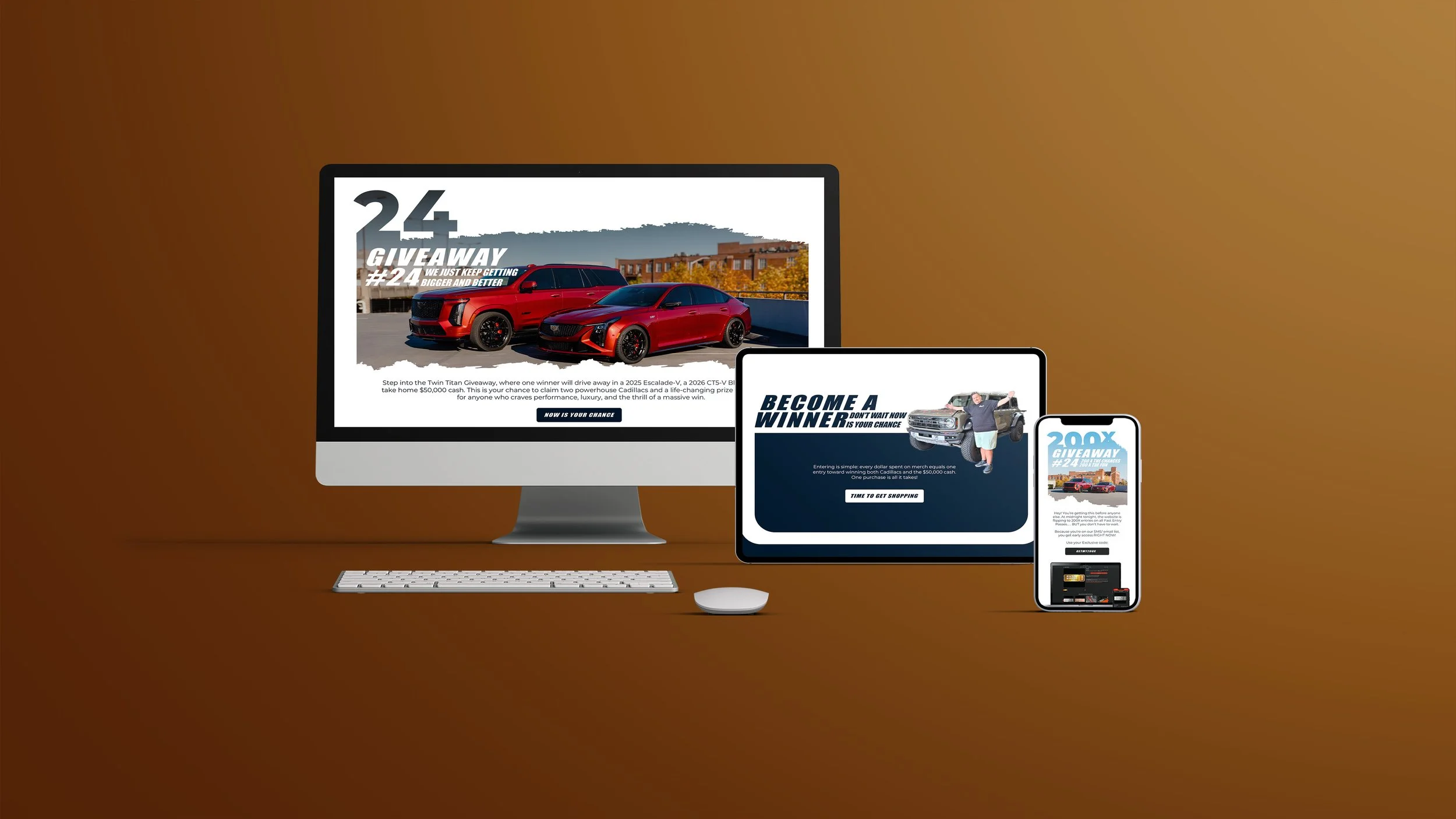
Key Benefits
Instant Brand Authority
Frictionless Campaign Scalability
Agressive Conversion Performance

The Twin Turbo
White Label
The Twin Turbo Pack was born from a strategic white-label partnership with Parlor City Pepper Co. Goonzquad’s objective was to take an existing variety pack and completely re-imagine it through the lens of their high-octane automotive lifestyle. My role was to navigate the brand harmonization between the two companies—respecting the core Parlor City identity while injecting the raw, "high-speed" energy of the Goonzquad world.
To elevate the perceived value of the white-labeled product, I treated the packaging as a mechanical metaphor for the brothers' famous supercar rebuilds. The exterior of the box was designed to represent the chassis of a McLaren; opening the lid was engineered to mimic "popping the hood" of a mid-engine supercar. Inside, the original variety pack was transformed into the "engines"—two bottles of Turbo Sauce acting as high-performance fuel for the build. This unboxing ritual provided a repeatable rubric for future collector’s editions, turning a food product into a physical extension of the Goonzquad garage.
Scope of Work
Brand Harmonization & IdentitySystem ArchitecturePackaging DesignPhotoshop ManipulationStrategic White LabelingCopywritingExperience DesignSocial Media & Email Design