
Logo designed by Kyle LaatschFull Website OverhaulBEACON
BAPTIST CHURCH
For the love of Christ Compels Us
CHALLENGE
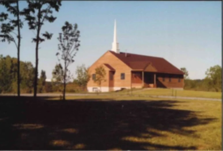
Beacon Baptist Church needed a full website redesign to better reflect who they are today while honoring their nearly 50 year history. The existing site felt outdated, text heavy, and fragmented, making it difficult for newcomers to understand the church’s mission, beliefs, and community life. The challenge was to create a clear, welcoming digital presence that communicated Beacon’s gospel centered convictions while remaining warm, accessible, and easy to navigate for both visitors and long time members.
INSIGHT
At its core, Beacon is not a building, but a people shaped by Scripture, community, and mission. The redesign needed to visually and verbally reinforce that truth. Key themes emerged through the process: light, guidance, faithfulness, and intentional discipleship. Drawing from Beacon’s lighthouse identity and the biblical imagery of light, water, building, and community, the site was designed to feel grounded, trustworthy, and alive. The experience needed to remove barriers for first time visitors while giving members clear pathways to engage, serve, and grow.
SOLUTION
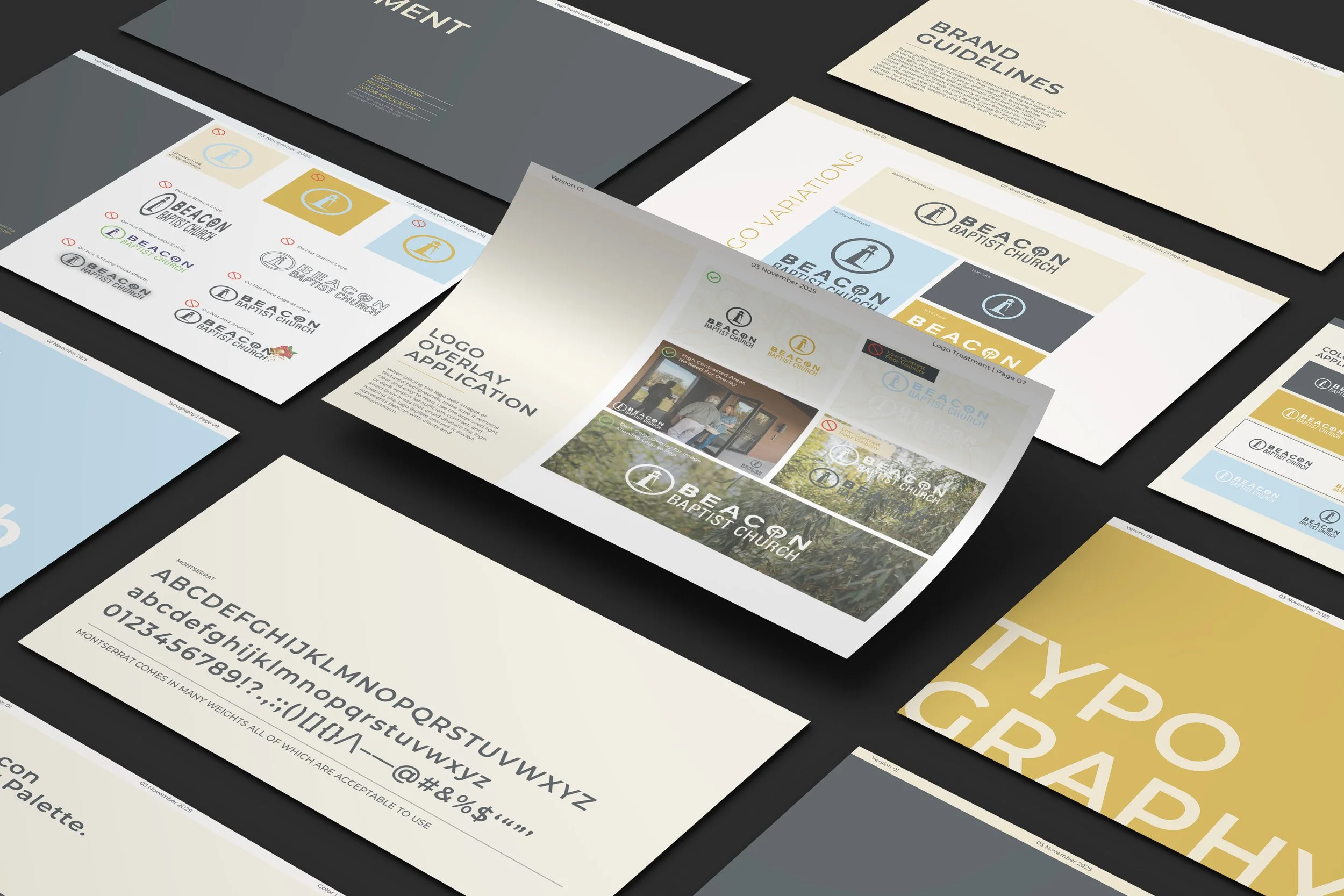
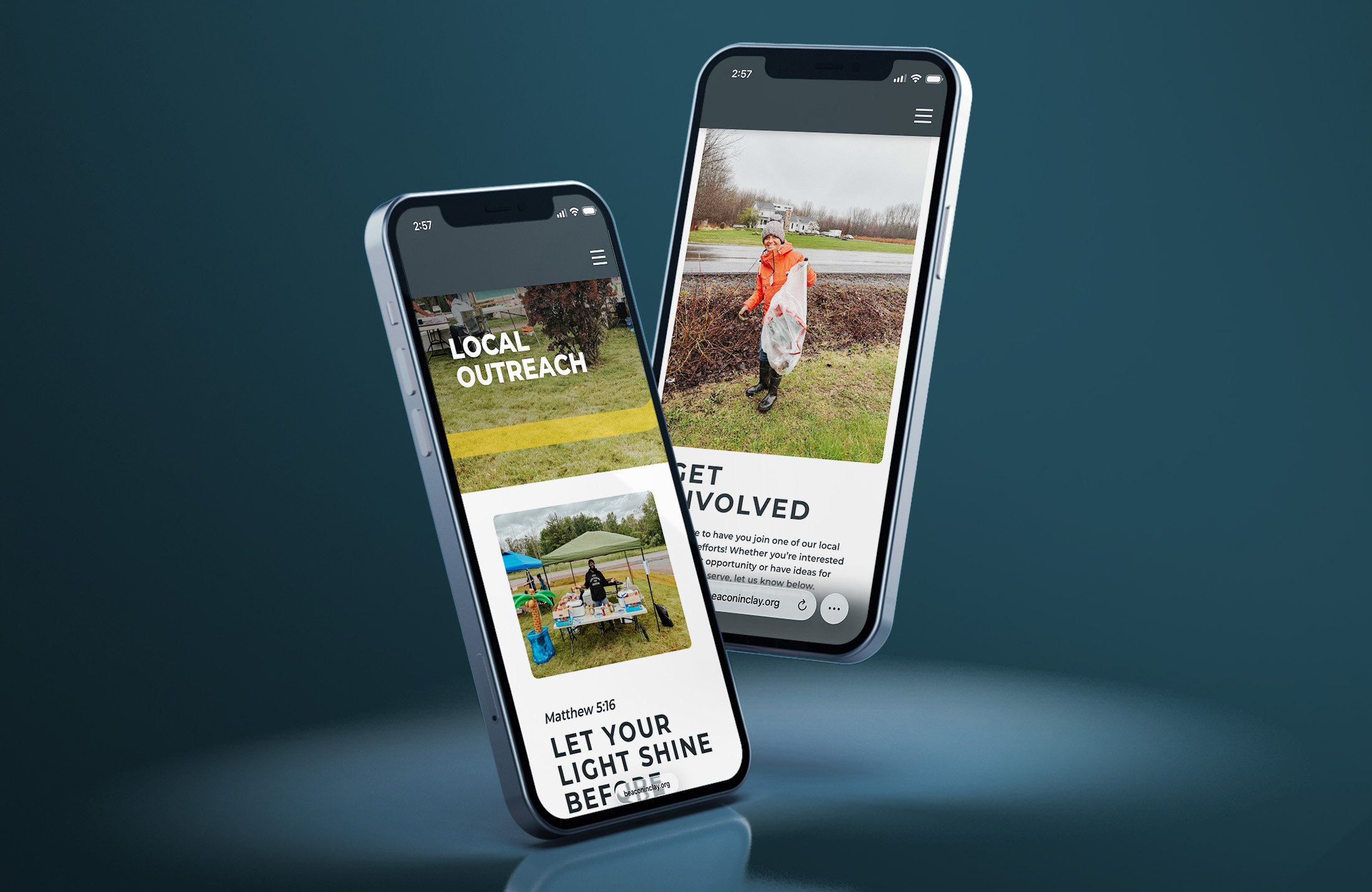
The solution was a complete website overhaul that combined thoughtful content strategy with a clean, structured visual system. Acting as a brand steward, I utilized the church’s existing logo as the visual anchor, building a comprehensive digital design system around it that includes a refined color palette and intentional typography. The site architecture was simplified, page content was rewritten for clarity and warmth, and ministries were organized in a way that felt approachable rather than overwhelming. Subtle organic textures, natural imagery, and consistent typography were introduced to bring depth and visual interest without distraction. Special care was taken to clearly communicate Beacon’s beliefs with truth and compassion, while inviting exploration rather than confusion. The final result is a cohesive, mission-driven website that serves as both an invitation to newcomers and a functional hub for the church body.

Key Benefits
Clear and Welcoming Visitor Experience
Unified, Gospel Centered Brand Identity
Clear and Accessible Communication
BEFORE AND AFTER: CLICK & DRAGDesigning for Clarity
My approach for the entire Beacon project was rooted in a single objective: to transform complex information into an inviting digital experience. For a church with deep convictions, the challenge was not just to shorten the content, but to present it with a sense of clarity and intentionality. I wanted to move away from a document heavy feel and toward a modern interface that balances truth with warmth.
On the Beliefs page specifically, I focused on making dense theological content approachable and digestible. By implementing a clean hierarchy and interactive accordion menus, I removed the visual friction of the original text wall. This design decision allows visitors to engage with the content at their own pace, giving them the freedom to explore deeply without feeling overwhelmed.
By prioritizing white space, refined typography, and intuitive navigation, the final design serves as both a clear statement of faith and a functional tool for the community. It reflects my broader goal for the project which was ensuring that every digital touchpoint feels like a professional and welcoming extension of the church mission.
Scope of Work
Brand Strategy & MessagingVisual Identity & Art DirectionPrint & Digital Collateral DesignPhotoshop ManipulationCopywriting & Content StructureBrand Guidelines & System DocumentationExperience Design